
With the endless days of sunshine and blue sky these past weeks, summer has finally made an entrance in Vancouver! If you hadn’t quite gotten around to that spring cleaning you had intended, perhaps now is the time for a thorough (belated) spring-clean of your business in the form of a rebrand or refresh.
a million reasons
An update in branding can do a lot for the success of your business or venture. Some reasons you may want to consider shaking things up a bit:
- Your message has changed
- You want to better convey your brand message
- Your business is growing or is poised for growth
- Your brand hasn’t been seeing the growth you’d like
- You’re not reaching the audience you’d like to
- You want to show that you’re active and care about investing in your brand
- You want to stay ahead, be relevant, and show who you are
refresh vs. rebrand
Think of your brand update like a fresh coat of paint. Or a cool new haircut. Or like your brand went on a silent yoga retreat and returned with a new outlook on life. The great thing about thinking about your brand in these terms is that there’s no limiting how far you can go. You can preserve your messaging while breathing new life into your image, or simply tweak your presentation while maintaining the recognizability you’ve worked hard to achieve. Typography, in particular, is key when it comes to any kind of rebrand, and can be hugely impactful in keeping your logo looking current. A good rule of thumb when it comes to the lifespan of your logo is to consider a refresh every five years while taking a more in-depth look with the possibility of a full rebrand every ten years.
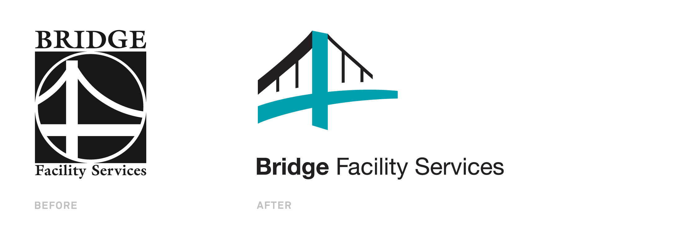
Check out the sleek rebrand Hangar 18 recently worked on for Bridge Facility Services:
Or the more subtle but impactful brand refresh of Mastercard by the brand masters Pentagram you can check out here.
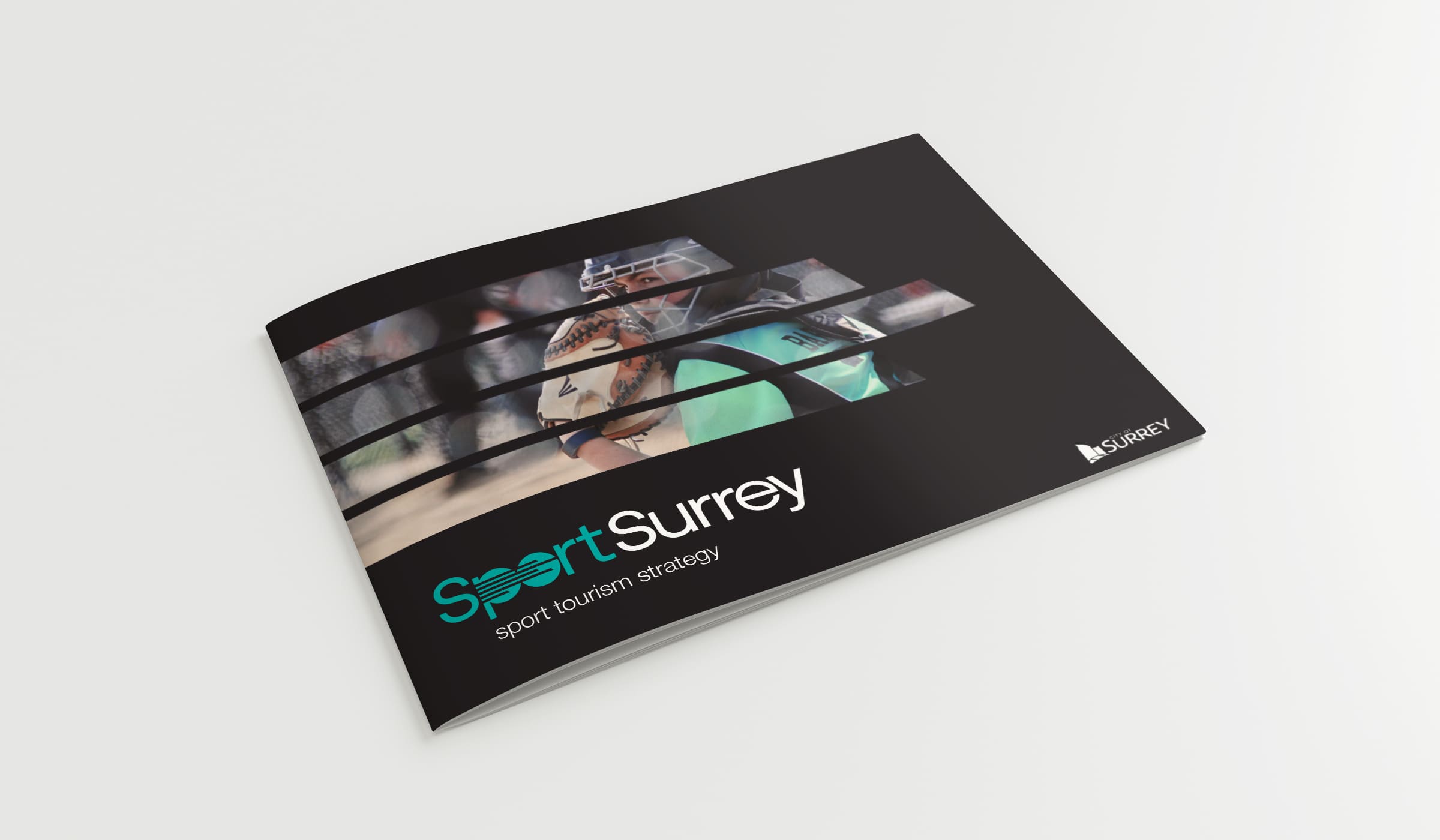
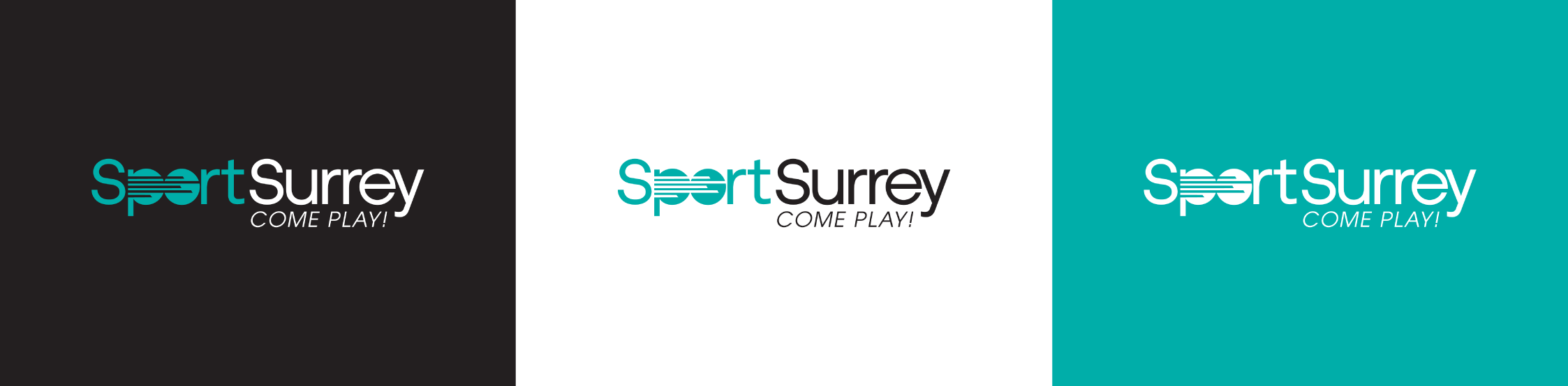
Recently, Sport Surrey approached Hangar 18 interested in revamping their brand identity and we were happy to help. The result better conveys the energy, accessibility, and diversity of their growing organization.

ch-ch-changes
Potential and existing customers alike will notice the jolt of excitement that comes from your revamp, allowing a unique marketing opportunity to capture the attention of this audience without being pushy or gimmicky. The results are more competitive, meaningful, and valuable business. Internally, a refresh can also lead to better understanding and fine-tuning of your brand and help chart a path for the future.
Are you ready for a change? We’re ready to help spruce up your brand or hit the reset button. Whatever you have in mind (or if you aren’t sure where to begin) give us a shout at [email protected].