Imagine you encountered intelligent life from interstellar space. What would you say or more importantly how would you say it? You would greatly improve your chances of communicating more clearly if you tried to converse by use of a picture or graphic.
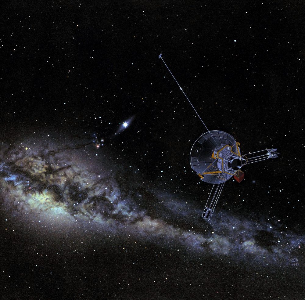
That’s the reasoning behind NASA’s Pioneer 10 and 11 satellite launch and the visionary cargo aboard. Both satellites have identical cargo, a Golden Plaque placed aboard the 1972 Pioneer 10 and 1973 Pioneer 11 spacecraft. The plaque features pictorial messages in case either spacecraft were intercepted by extraterrestrial life.
GOLDEN PLAQUE HIGHLIGHTS AND LOWLIGHTS
On the plaque, there are several informative graphics including a graphic outline of a male and female figure with a hand raised. The original drawings of the figures were based on drawings by Leonardo da Vinci and Greek sculptures and more than a few Americans were upset in 1972 because they were not dressed appropriately. In fact, they wore nothing but their birthday suits. Shame! (visual not shown to avoid filters)
Other graphic elements include a silhouette of the satellite in the same scale as the drawings of the human beings so that the size of the human beings can be deduced by measuring the spacecraft. There also is a map of our earthly location using 14 pulsars as reference point to pinpoint our solar system.
At the bottom of the plaque is a schematic diagram of the Solar System which shows a small picture of the spacecraft, and the trajectory taken past Jupiter and out of the Solar System.
VINYL IS COOL. GOLDEN IS COOLER
In 1977 mankind launched a second set of galactic messages into the vast sea of interstellar space. Etched on two golden records aboard the Voyager 1 and Voyager 2 spacecraft, are audio sounds of music from all over the globe, greetings in many different languages, sounds of nature, and encoded pictures of life on earth.
But some assembly was required before you could play the record. Therefore, scientists designed the first instruction manual to be sent out of our solar system. It included instructions done in a way that could be communicated to any alien lifeform. It was determined that the best way to do that was to communicate through graphics. Can you say IKEA?
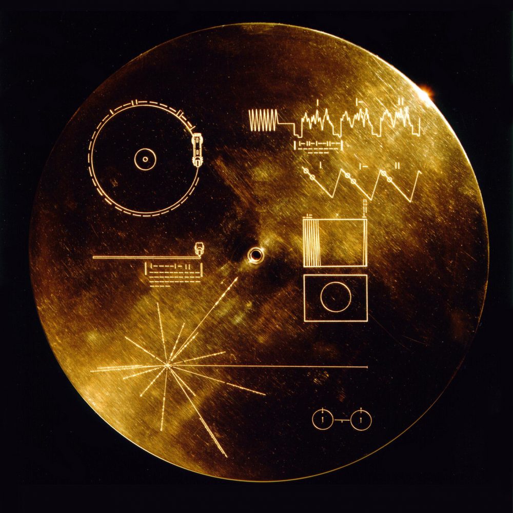
GOLDEN RECORD COVER
On the cover plate of the record, there are several graphic diagrams showing how to play the records underneath the protective covering. There also was a galactic map based on pulsars, and a drawing of the hydrogen atom in its two lowest states to be used as the fundamental time scale, both for the time given on the cover and in the decoded pictures on the records.
One can safely say it was the first info-graphic to go into interstellar space.
GEEK WARNING
The following description is a detailed explanation what was chosen and the information it hoped to convey. For science geeks, this may be interesting. For the rest, you may want to skip this part and go right to the pictures.
In the upper left-hand corner is an easily recognized drawing of the phonograph record and the stylus carried with it. The stylus is in the correct position to play the record from the beginning. Written around it in binary arithmetic is the correct time of one rotation of the record, 3.6 seconds, expressed in time units of 0,70 billionths of a second, the time period associated with a fundamental transition of the hydrogen atom. The drawing indicates that the record should be played from the outside in. Below this drawing is a side view of the record and stylus, with a binary number giving the time to play one side of the record – about an hour.
The information in the upper right-hand portion of the cover is designed to show how pictures are to be constructed from the recorded signals. The top drawing shows the typical signal that occurs at the start of a picture. The picture is made from this signal, which traces the picture as a series of vertical lines, similar to ordinary television (in which the picture is a series of horizontal lines). Picture lines 1, 2 and 3 are noted in binary numbers, and the duration of one of the “picture lines,” about 8 milliseconds, is noted. The drawing immediately below shows how these lines are to be drawn vertically, with staggered “interlace” to give the correct picture rendition. Immediately below this is a drawing of an entire picture raster, showing that there are 512 vertical lines in a complete picture. Immediately below this is a replica of the first picture on the record to permit the recipients to verify that they are decoding the signals correctly. A circle was used in this picture to ensure that the recipients use the correct ratio of horizontal to vertical height in picture reconstruction.
The drawing in the lower left-hand corner of the cover is the pulsar map previously sent as part of the plaques on Pioneers 10 and 11. It shows the location of the solar system with respect to 14 pulsars, whose precise periods are given. The drawing containing two circles in the lower right-hand corner is a drawing of the hydrogen atom in its two lowest states, with a connecting line and digit 1 to indicate that the time interval associated with the transition from one state to the other is to be used as the fundamental time scale, both for the time given on the cover and in the decoded pictures.
As communicators, H18 understands the power and effectiveness of speaking graphically. Especially in the 21st Century where you only have a second or two before your audience phases out.
Two successful graphic driven projects we worked on involved the City of Vancouver (COV) where we were tasked to engage a fickle audience about voting and another about conserving water.
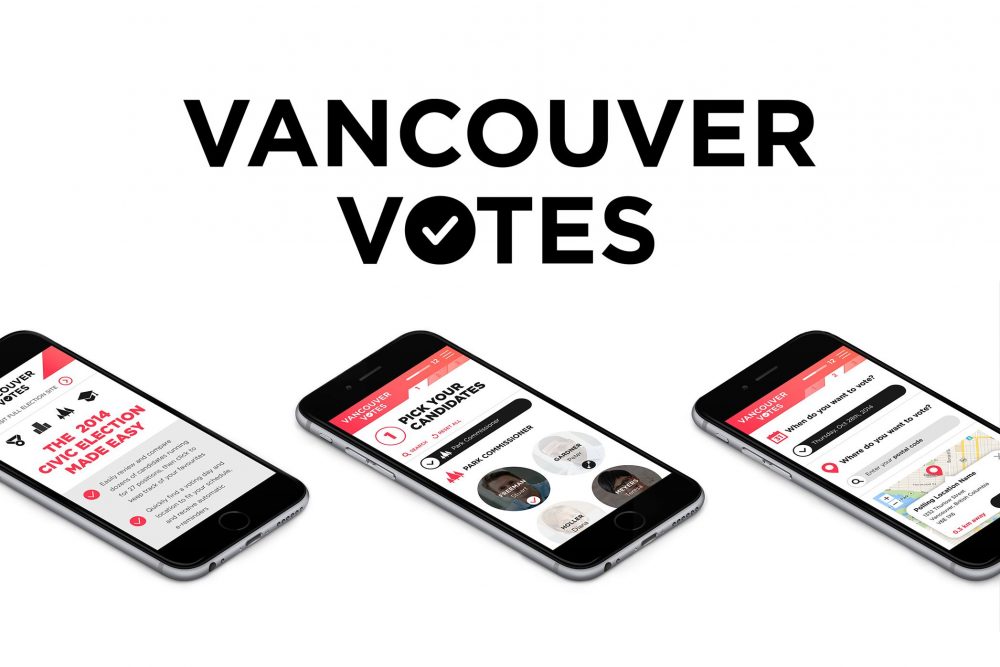
1. OBJECTIVE – VANCOUVER VOTES
- Increase voter turnout from 35% to 40%, specifically targeting young people to become more engaged and become voters.
INSIGHT
- A vast majority of young people don’t vote. They don’t know the candidates and the teams and frankly many of them don’t relate to the current voting system.
SOLUTION
- Gamification of voting information to appeal to young demographic, designing a bold and graphically driven innovative election-planning tool to pick your players and team
- H18 created a graphically simple game board platform and user-friend interface with players, skill sets, positions and teams encouraging our audience to pick your own team
RESULT
- Final turnout was announced as 43.4% in 2014, up from 35% in 2011. An increase of 8.4%
- The planning tool was buzzing. Analytics recorded younger voter participation was greater than ever
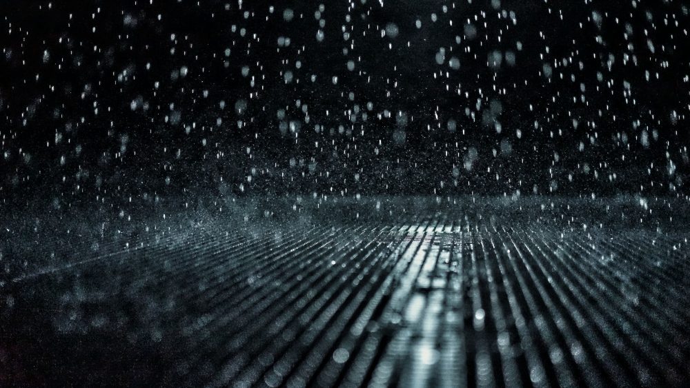
SIX MONTHS OF RAIN
Vancouver has 6 months of rain, at least it seems like that. That’s a lot of water to contend with. Now try to tell Vancouverites that they must conserve water.
2. OBJECTIVE – WATER CONSERVATION WIDGET
- Educate Vancouverites about the need to conserve
- Drinking water in the summer months where 70% of residential water use is used outside, much of it going down the drain
INSIGHT
- “Treated drinking water does not just fall out of the sky”
SOLUTION
- Create a simple animation of an amazing journey of a single raindrop falling from the sky, travelling through forest, lakes, dams, and entering treatment facilities, storage areas and city pipes, finally ending up dripping out of your backyard tap that leads you to an information quiz
- H18 also created a fun and informative graphic checklist on a downloadable widget which came alive when you tried to guess where all the water went and how you can stop the reservoir from going empty with easy to follow tips
RESULT
- It was an unqualified success, xx thousand widgets were downloaded, the client was very happy and integrated the program with incentives that encouraged people to become water savers, continuing the program for a second year in a row. (see images on the next page)

3. OBJECTIVE – IN-ROOM DINING MENU LIKE NO OTHER
- The Fairmont Waterfront hotel showcases the best of Vancouver and they wanted something special
- They needed a custom in-room dining menu that paired items on the menu with the dozens of fantastic things to experience close by. It also had to work visually to cater to the many international guests they wanted to appeal to
INSIGHT
- “Say it in pictures”
SOLUTION
- Hangar 18 designed over two dozen visual icons that ranged from a night of espionage to a morning jog around the seawall
RESULT
- It won an international award and was a universal success with the client and their guests