
Same Brand, New Look
Spring is on the horizon (if the snow doesn’t keep falling), and for many, that means a fresh start. There are a bunch of reasons why you’d need a rebrand. Maybe your branding is a bit outdated and is no longer relevant to the world today. Or your company is growing and the branding needs to keep up. Whatever it may be, there are great benefits to taking the plunge.
A brand refresh can help not only in the short term but in the long run, too. Key benefits can be summed up in five main points.
- Adhere to a new target audience
With a new visual language comes more attention. Brand awareness grows and before you know it, without even meaning to, you have gained a whole new demographic of people interested in your brand. - Relevance
As your brand continues to grow, there has to be consideration for what is going on in the world around it. Refreshes can bring in new life, and help your brand look ahead to what the future holds. - Communicating Values to Consumers
Consumers are looking for brands that align with their beliefs. It’s up to the brand to show them what they are all about and flaunt it. By doing so, your consumers will feel more connected to what you’re offering. - Improving Customer Loyalty
Customer loyalty is BIG. Brands are able to stand against time because of the relationships they’ve built with their customers. This starts with the day-to-day operations, and continues with the visual language. Improving in any of those categories can only help the relationships built. - Differentiating from the Competition
Markets become saturated, and it gets hard to cut through the noise. Introducing a new and interesting visual identity can make you stand out from the crowd, and change the market.
(Photo By: COLLINS)
It’s a Girl’s World
(And we’re just living in it)
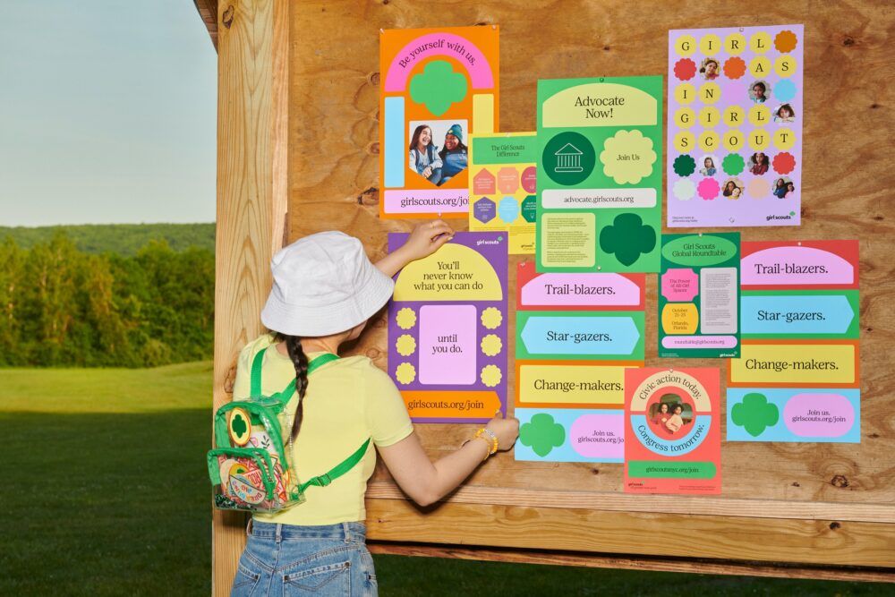
When you think of Girl Scouts, the first thought is cookies…right? Well there is much more to the Girl Scouts of America. They first started in 1912, and have only seen success since. As they continue to grow and evolve with the world, they need a brand identity that is looking to their bright future. Just last year, COLLINS got the opportunity to take on this big task and they did not disappoint. With a new logo, badge system, and colour palette, they managed to unify 112 independent councils under one visual identity.
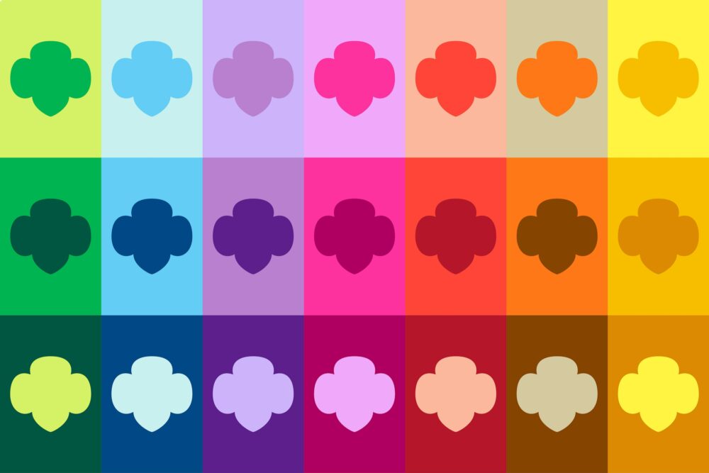
There’s something special about brands that have such a rich history, their logos can tell us a story. Girl Scouts have honoured the Trefoil since the beginning and reintroducing it in a modern and approachable way speaks to the brand’s new direction. Traditionally seen in green, black, or white, the emblem can now be used in a wide variety of bright colours if the audience is familiar with the brand. While on the surface this is a small change, it expresses a new sense of freedom and empowerment from the brand.
(Photo By: COLLINS)
In ensuring all 112 councils can still have some visual liberties to suit their needs, COLLINS set up a sweet badge system that can be used for all materials. Inspired by Girl Scout patches, shapes were altered to have a more geometric look to emulate what was done with the logo. These shapes can hold type, photos, stand-alone, and create the base of a layout. In tandem with the badge system, we see this bright colour system come into play. While seemingly random and mismatched, it all makes sense once delving into the brand guidelines. With a whopping 24 colours at their disposal, there’s a lot going on. There are three groupings of audiences the colours would adhere to. For a more playful group, vivid colours with high contrast (neons) are best suited for this younger crowd. For the older girls and volunteers, colours with a low contrast and in the pastel range work best. In both these categories, there is freedom to mix and match. In the final category, there is more of a monotone approach. For a professional audience, colours are dark and vivid, and pair with the similar pastels. Colours also get broken down into grade levels and cookie flavours (the best part of Girl Scouts in my opinion), each having their own colour associated with them. This cheerful way for designing Girl Scouts has brought the brand to today. It has created space for what girls can do for themselves and the world around them, while still remaining fun and approachable.
The brand guidelines have ensured the continuous execution of the new Girl Scouts so they can take up space and are punchy, remaining true to the brand’s purpose of empowering girls. Take a look at it here: Council-Specific Guides Girl Scouts Marketing
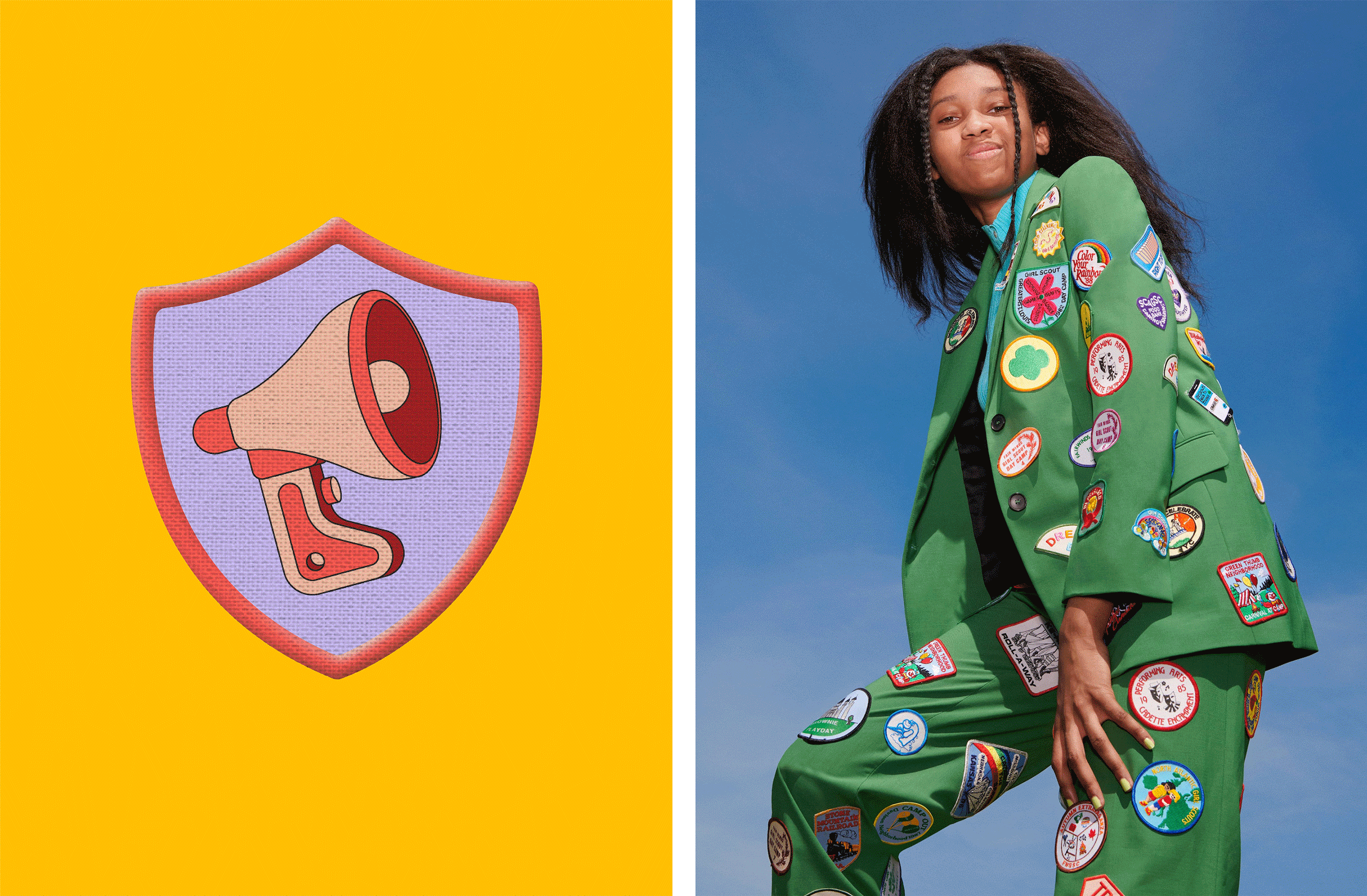
(Photo By: COLLINS)
COLLINS has done an amazing job in the execution of Girl Scouts, with a Trefoil poster series, right down to their uniforms. Check out the rest of their work: COLLINS
Is your brand current? Has your brand story evolved over time?
Visually a brand refresh can help add vitality and newfound purpose to those businesses that suffer from a lack of growth and brand fatigue. On the messaging side of things, a straightforward brand story is increasingly valuable as today’s businesses look for differentiation and want to express this point of difference clearly.
Every 5 years A company should do some housekeeping.
No matter how large or small, it’s wise for each company to routinely give its organization’s image a dusting-off to stay relevant. It may be a brand audit, reworking your brand strategy, considering a brand refresh, writing a current brand story to grow market share, or keeping the messaging consistent with the way the company grows. That’s how the best brands keep it simple and continue to succeed.
At H18, we suggest brands should be updated every five years or so and consider a complete overhaul every 20 years. Like every other asset in a company—like a piece of machinery—a brand is going to depreciate over time.
By working closely with our clients, we find simple ways to get to the essence of your brand, we get to go a bit deeper to find the clarity and vision that today’s businesses need to remain vital and progressive.
Please don’t hesitate to reach out to us. Brands are why we’re here.
Written by Vida Jurcic, Founder and Co-Creative Director – Burnaby, BC