Here at Hangar, one of our favourite parts of the job is creating logo for our clients. This may be for a brand new start up or providing a refreshing face lift to a company going through growth or transformation.
For us to create a logo that fits our clients’ brand, message and potential applications we have a well-practised process. It starts with a discovery session to learn about the product, service, people and vision behind the company and future logo. We perform a competitive analysis, study the demographics of their target market, and ask for logos that they love and logos that they hate! All of these give us a good insight into which direction to go in and what to stay away from. Next up, we create mood boards with colour palettes, typography, lifestyle images, logo direction, textures, and overall creative direction. This helps us paint a better picture in our clients’ eyes about our future vision.
Now it’s time for our amazingly talented creative director and graphic designer to take it away. We never know when the design idea is going to hit their brains – more often than not, it isn’t visualized between 9 – 5 in the studio. The Richmond Olympic Experience logo, for example, Vida sketched on the couch one night around midnight while snuggled up on the couch with her cat, Claudia.
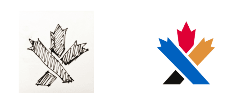 After the creative juices flow and we have three to five logos that we love and are proud of, we present them to our clients with potential colours and applications. We try it on business cards, a website, transit shelter ad (TSA), a real estate sign, a moving truck – wherever it may be used to really see what fits best.
Selecting the perfect logo can be a tricky task, it is a big deal! Kind of like naming a child, you’ll be seeing it a lot and you need to love it! But it also needs to suit the purpose– a lot of our task involves educating our clients. Many business owners want a logo that is at times too literal and busy, but yet simple and hidden symbols tend to live on and be the most recognizable. Let’s take a minute to think about the world’s most famous logos and think whether you would have approved your creative agency’s design upon seeing them for the first time:
McDonald’s
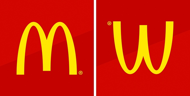
The designer of the first McDonald’s restaurants came up with the idea to equip the buildings with two large golden arches. These architectural features quickly became the symbol of fast food. Later, the company wanted to abandon the logo, but psychologist Louis Cheskin persuaded the management to keep it. He argued that this symbol looked similar to an upside-down image of the female breasts and therefore reminded people of their carefree childhood.
Amazon
The Amazon logo is an extremely simple logo and while the arrow may just look like a smile it actually points from a to z. This represents that Amazon sell everything from a to z and the smile on the customers face when they bought a product.
Gillette
At first glance, it might seem that this logo consists of nothing more than the Gillette brand name. But, if you look closely, you can see that the edges of the letters G and I mimic the shape of the famous shaving machine’s blades.

Nike
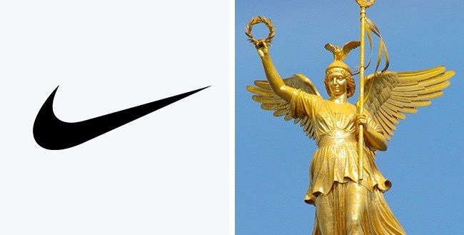
A student named Carolyn Davidson was paid a mere $35 for designing this logo in 1975. As you can easily guess, the world-famous symbol represents the wings of the Greek goddess Nike who used to inspire warriors to victory.
Goodwill
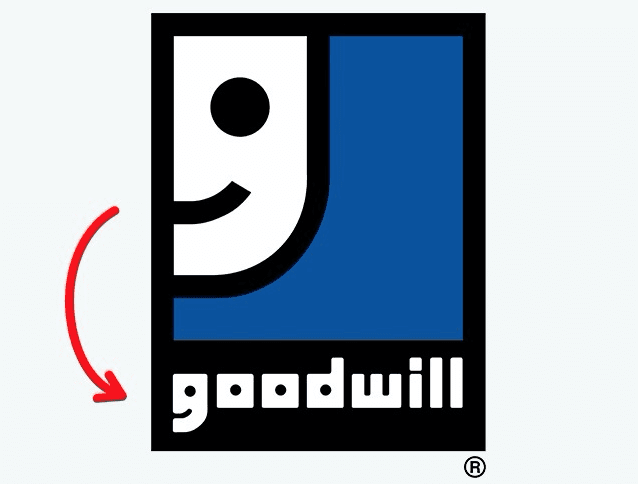
Goodwill is a world-renowned non-profit organization that collects donations of food, clothing, and essentials to help the needy. Employees of the organization believe that doing good deeds shouldn’t be regarded as something out of the ordinary but rather as an everyday activity. That’s why their logo is built around the letter G, which, from a distance, resembles a happy face.
FedEx
Most people don’t immediately see the arrow formed by the empty space between the letters E and X. But, once someone notices it, he or she begins to see it first and foremost whenever looking at the logo! And that’s exactly what the designers were aiming for: the arrow acts on the customers’ subconscious, symbolizing the courier service’s speed and trustworthiness.

We have many logos in our repertoire, from YVR to YYoga and Trinity Western to Fairmont’s ARC, we love seeing our work around the country! If you’re thinking about updating your branding or starting from scratch, give us a holler. It’ll be fun!
