It started with a question
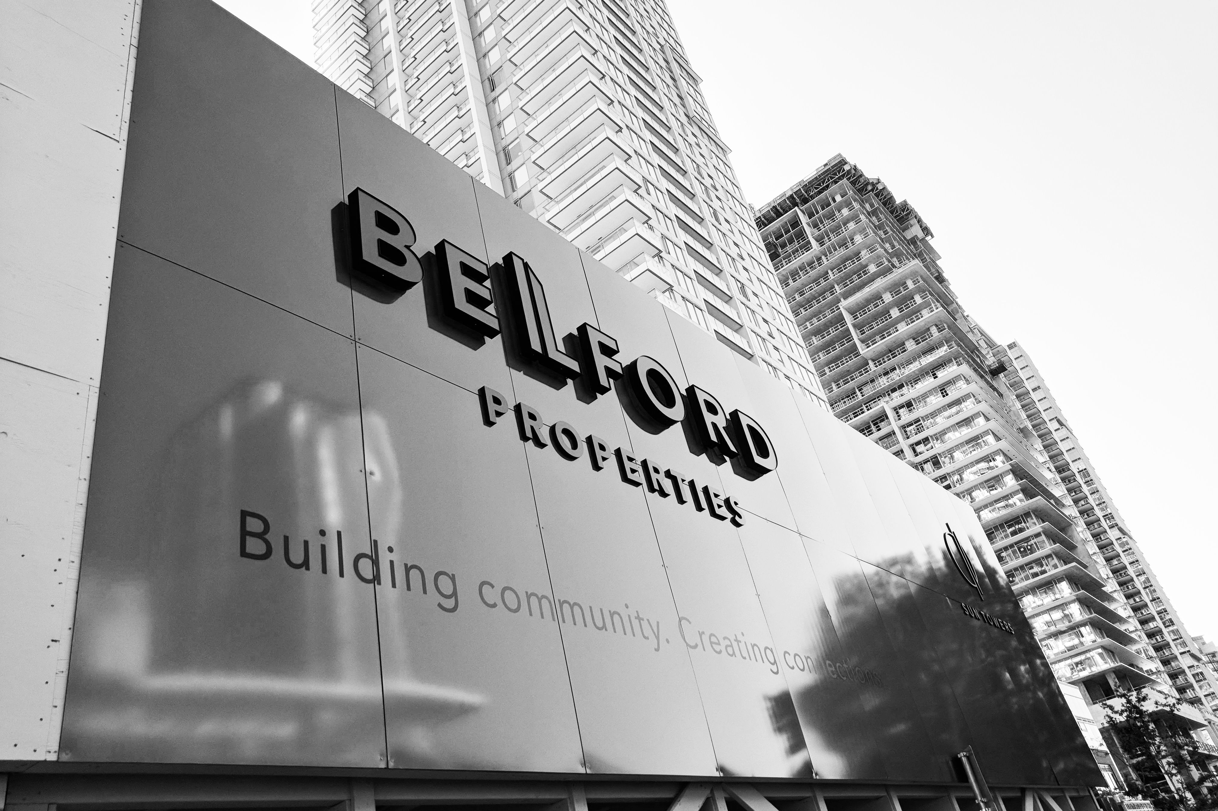
Our client, Belford Properties, asked us a question, “We want you to design our hoarding, but can you include children’s art as part of the design?”
(For those who may not know, a hoarding is a large plywood wall, a temporary structure built around a work site, which serves to protect the public from the activity behind the wall and prevent unauthorized access. The outside panels of the hoarding wall are often uninspired and mainly display company logos and corporate signage.)
We were excited, and a bit wary. It’s easy to say “yes” and of course we could make it work– especially since a few of us at Hangar 18 Creative have had experience on several kid-directed creative projects including BC Children’s Hospital and McDonald’s. We knew it could be both fun and also a challenge. A lot depended on the idea and the expectation of the children’s artwork and what we were hoping to achieve. First things first, experience has taught us to ask an intelligent question or two before we begin to even think about the details and start to create.
Two questions in return
“How tall is the hoarding?” & “Who are you trying to attract?”

The client opened up, “20 feet tall, and we want everyone on the Skytrain to see it!” They were very excited about the possibilities and expressed their hope that the hoarding art might act as an effective social media tool spreading positivity throughout the community. They wanted the kids art to be the main focus and made it clear that every kid that participated needed to be represented with their artwork on the wall – no exceptions. Emphasis should be placed on the children’s art with a mention of Belford Properties supporting the initiative. The client then added, “And you could have 50 feet of space to work with.” We thought at the time that it sounded like a big area to work with.
That soon changed.
The most important question
“How long is the hoarding going to be up for?”
The answer was “two and a half years, possibly three.” That blew us away. We did not expect that. Three years is almost an eternity. This changed the entire scope. We had to come up with something that people would not phase out too soon. This would require some big ideas. We said “yes, we’d love to take on the challenge” and walked away feeling inspired.
The House of Inspiration
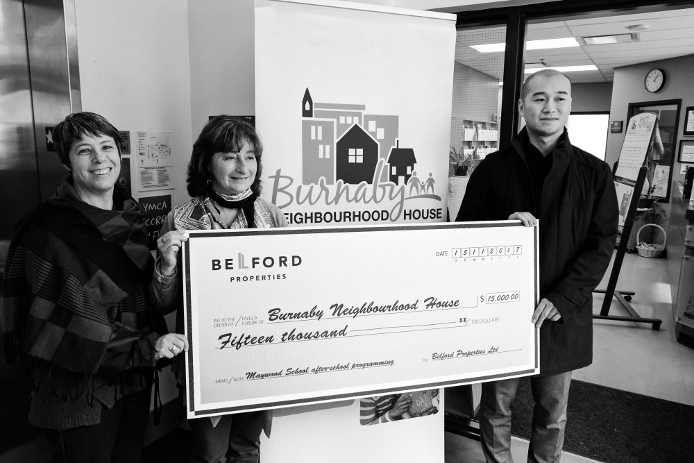
The client’s wish was to use children’s art from a community organization that they were very enthusiastic about called Burnaby Neighbourhood House. They also told us they were intending to provide them with much needed funding for the next several years. We thought it was very important to visit BNH personally to see what was possible and to experience for ourselves what the client was so excited about. We set up a meeting with the art teacher that was instructing the kids. The art classes that Burnaby Neighbourhood House put on, reach out to new kids in the neighbourhood. The classes were after school and directed to kids who recently arrived in Canada. They took us on a tour and we had a great informative session. We saw how vibrant and enthusiastic everyone was, meeting many of the new Canadians young and old that have recently immigrated here and saw a variety of the well-attended programs in action. It opened our eyes wide and the creative wheels started spinning.
An idea that lasts
What could we do with children’s art that would evolve over time, specifically for three years, multiple seasons, at times in nasty weather, and still be cool to a wide demographic? And oh ya, be noticeable from across the street at the Skytrain station and if possible, be strategic and engaging? No problem.
A big idea that grows and grows
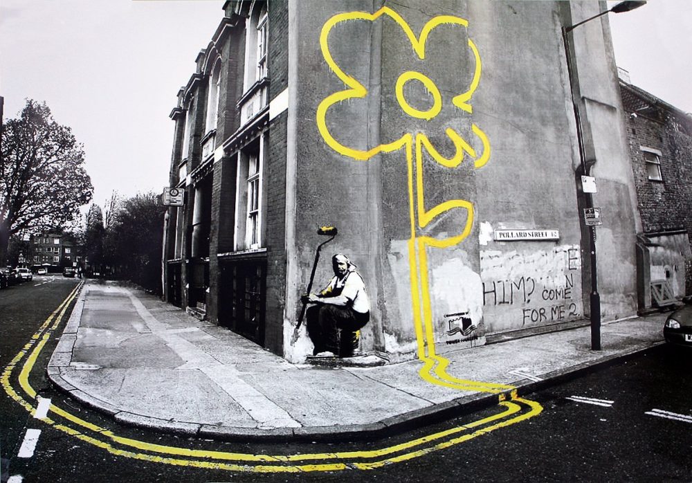
Children’s art can look super impressive if it is scaled up to be super-sized. A child’s drawing of a simple daisy that is 20 feet tall instantly becomes a wall mural and if it is 3D it becomes a sculpture that you can look up to. The artwork of Banksy came to mind. I remembered art work of a giant flower going up a wall from a single painted yellow line from the street that went up the building.
Can we create an art installation that uses scale to attract attention? And what could the kids create that tells a story over a three year period?
Learn to think and feel like a child
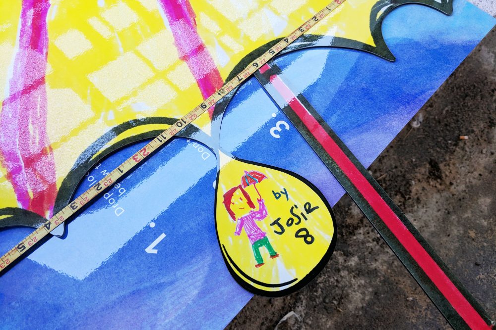
Adults hate the rain but bear with it. Children love it, choosing to jump fearlessly into puddles, catching the rain on their tongues, and parading around with colourful umbrellas. Bring it on. To kids, all the seasons are magical. Children see the world differently. They can simplify most things to the very basics. All they want to do is to grow up, become more independent and have fun. We wanted to harness that energy and spread good will. We thought it would be easy for the kids to draw, paint and create colourful umbrellas. What else could they create and where can this beginning thought go?
A simple formula that kids And clients can relate to
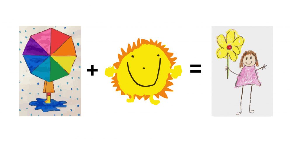
Children love the rain, love the sun, combine the two and you allow things to grow; like flowers! We came up with a thought so simple, a child could understand it. Rain + Sun = Growth. Adults can appreciate the simplicity of the formula. It works in nature and it also can be a larger-than -life metaphor. Over time, with the right ingredients, children, neighbourhoods and even buildings grow too. We thought, can the children’s art grow in time with the building going up behind the hoarding? And what would the children’s art look like?
23 umbrellas, FALLING rain, a rainbow, a bunch of suns, a field of flowers and butterflies
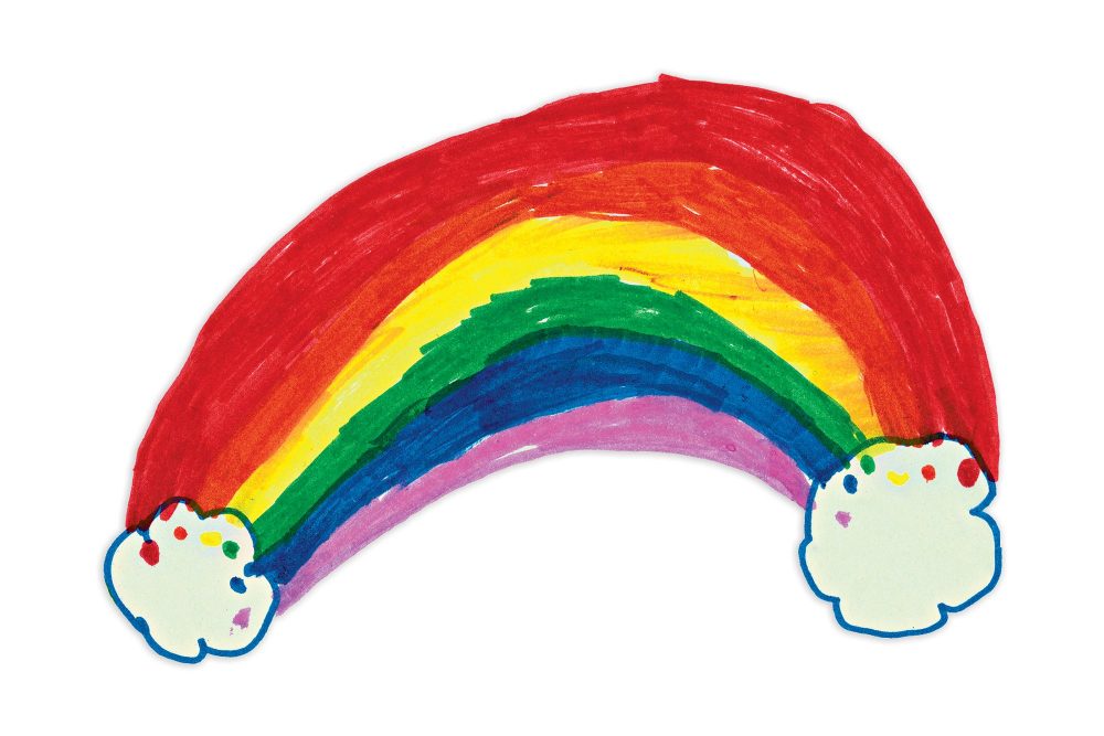
We wanted to cover the hoarding with very large umbrellas and feature a giant umbrella in the centre to anchor it, create a focal point and hopefully a photo opportunity for Instagram. Imagine standing beside a 20 foot umbrella and holding onto the handle. In phase two, a series of suns would take over the hoarding followed by flowers in phase three. Originally our client gave us 50 feet of hoarding space to work with and when they saw our first presentation they quickly encouraged us to expand the area to 96 feet wide. The client came back a week later and gave us the entire hoarding area to work with which maxed out to almost 200 feet.
We didn’t stop there
We wanted the artwork to be reused and even repurposed. The solution was to recycle the art work each year over three distinct phases, allowing it to grow and become more and more elaborate. Finally when the hoarding would need to come down, the art would be reused and repurposed by people and businesses in the community.
Rain + Sun = Growth
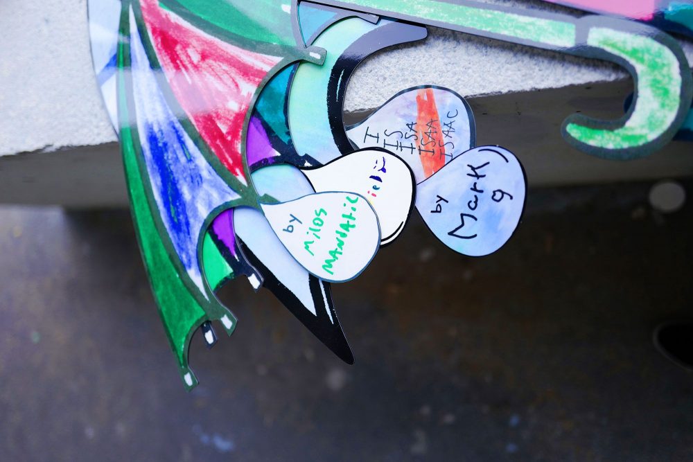
Imagine a giant wall of brightly coloured oversized umbrellas drawn by kids. Twenty-three umbrellas of varying sizes would be featured for the 23 kids participating in the first class. We imagined the covered walkway of the hoarding could be used to showcase life-sized umbrellas with each child’s first name and age. The largest umbrella was designed to be 24 feet wide and 20 feet tall, perfect for a photo opp. We also added a twelve foot rainbow and we celebrated the rain by making it dance with LED lights and designed the umbrellas to be lit up at night. We came up with the hashtag, #celebratebby, which allowed the public to engage even further by sharing images of the hoarding and their community with others.
Our partners that made it come to life


We depend on strong relationships with our partners and their ability to problem solve. They ultimately make us look good and without them many of our creations would not have come to life so easily. A key to the success of the project was working with PrismTech, a commercial printer which solved the problem of efficiently printing and cutting out all 23 individual custom umbrellas created by kids, including producing the 20 foot 3D hero umbrella that we hoped would stand up to the elements. They also advised a strategy and installation for all of the custom art pieces to be mounted to the hoarding in a timely fashion. We also tasked them with manufacturing and installing the custom coloured alupanel for our clients logo and messaging.
Let there be Light
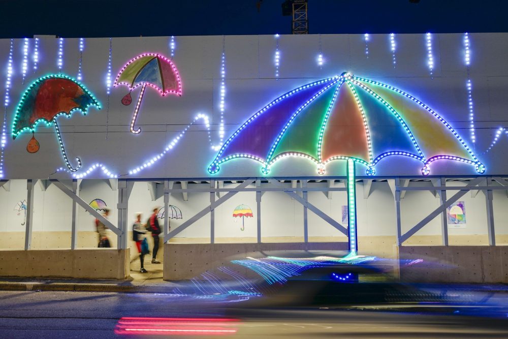
We live in a raining climate. Bright umbrella art in the day time is nice but at night it can fade away into the darkness. We wanted the hoarding to be festive in the evening as well. Like the beauty of neon lights on a rainy streetscape, we hoped our umbrellas could be designed to light up at night. Our Project Manager found the perfect creative partner that helped bring the idea to life.
Limbic Media was instrumental in bringing our wish of light and they relished the opportunity to show us what could be accomplished. Limbic Media understood the scale and complexity of the idea and worked with us to create custom lighting ideas that matched our vision. They sourced out-of-the-box interactive tech products that enhanced the idea and allowed us to entertain viewers in ways we did not think possible to create the attention we were looking for.
Falling rain and rotating umbrellas
Limbic Media worked with Hangar 18 Design Continuum to design a solution that could make the hoarding come alive with the illusion of falling rain and outlining the rainbow and the umbrellas with rotating lights. A custom program was designed to illuminate nine separate sections of the hoarding, controlling speed, intensity, colour and variables to match the vision. They came out to the site to oversee the installation and programmed the lighting with variations we asked for in real time. The system is so versatile that we envision changing the colour scheme throughout the year to match specific dates, special events and holidays.
Interactive donation box
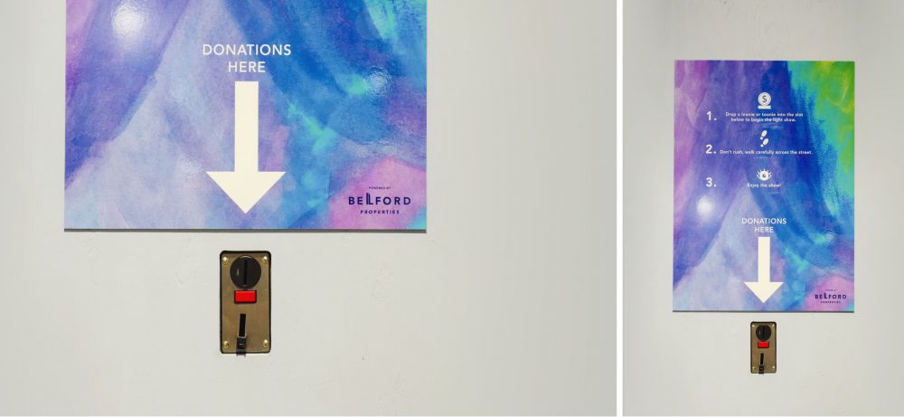
The client hoped that the public could be engaged with the hoarding and expressed a desire to give back to Burnaby Neighbourhood House. Hangar 18 proposed several interactive options using mobile texts, coin boxes, sound activated devices, that would trigger the light installation to become even more impressive with a donation to Burnaby Neighbourhood House. We researched these options with Limbic Media and arrived at a coin box system to bring the idea to life and appeased the client. A coin donation of a loonie or toonie designed into the facing of the hoarding turns the light installation on from a standby mode to an active mode. Once activated the movement of the lights speed up, the intensity of light increases and the colour of the light can change, creating a two and a half minute light show. The public would be encouraged to light up the street with a small donation to Burnaby Neighbourhood House by a series of posters mounted to the hoarding and messages on social media. The coin box is emptied each day and the public donations help Burnaby Neighbourhood House run more art classes for the kids.
Meanwhile across the street at METROTOWN SKYTRAIN station
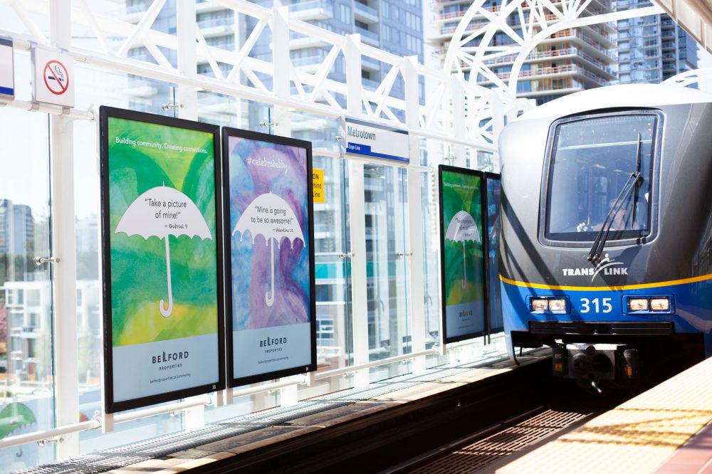
A month before the hoarding art was to go up, Hangar 18 designed Skytrain posters with background art that the kids created. This helped bring attention to the artwork that would be appearing soon. The colourful background of the posters framed a variety of blank white umbrella shapes that the kids were using as stencils. Sayings from the kids within the blank umbrella shapes encouraged riders to look out from the platform for umbrella artwork to appear directly across the street in the coming weeks. #celebratebby was featured for the first time and appeared on the posters and in social media. Images of the artwork being created in the classroom and images of the installation being designed and put together started to appear on Instagram. In a few weeks it all came together.
The future of the installation looks bright
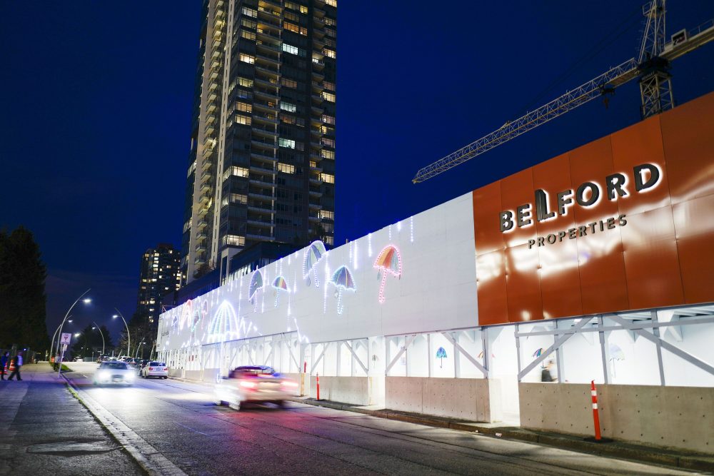
The hoarding is designed to grow in year two by adding a huge 20 foot sun in the centre replacing the giant umbrella, adding dozens of smaller suns that will also light up. Many of the umbrellas will still be reused, but pushed off to the edges of the wall. The building is called the Sun Towers and it’s a nice tie-in to the overall project. In year three, a 20 foot flower takes centre stage and a garden of oversized flowers will fill in the hoarding as the building grows taller. In the third and final phase we envision a colourful collection of children’s art all coming together to form a fantastic landscape. A vibrant wall of butterflies, birds and a landscape of bright flowers, smiling suns and carefree umbrellas.
Giving back feels good
When the wall is dismantled, a great deal of the artwork will be reused, some going to Burnaby Neighbourhood House, some donated to the community and some pieces auctioned off to charity. Hangar 18 was delighted that we were able to create a concept which allowed the kids artwork to come alive and help spread joy in the community. We’d like to also thank Belford Properties for supporting the concept and letting it grow to become something more special and meaningful to the kids and a way of giving back to the community.
The kids have something to feel proud of
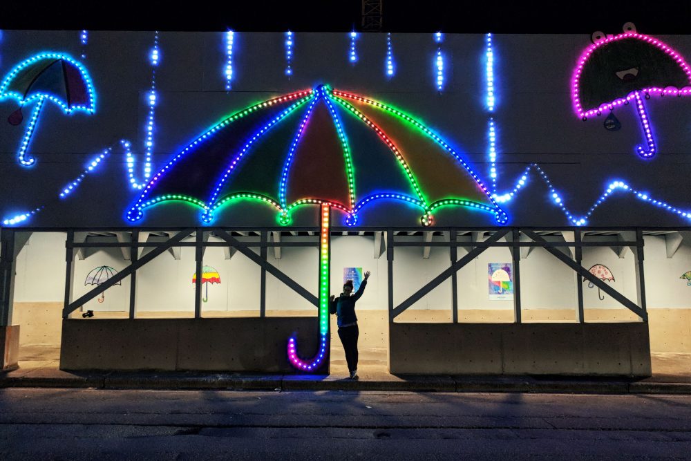
Little did we know what the impact of including children’s art as part of the design would mean. It became central to the whole project and became something much more meaningful than we could have imagined. Children think both big and small. They don’t see limitations– they see possibilities and the world as it should be. You can learn a lot from a child. The entire creative idea of the hoarding is now a testament about how kids, communities and big companies can turn a wall into positive change. A wall that helps to unite instead of divide.
If you are in the neighbourhood, please support the kids and the programs at Burnaby Neighbourhood House by donating a loonie or toonie and light up the street. You’ll brighten up the hoarding and spread cheer to young and old alike.
