
Options For Homes (OFH), a Toronto based not-for-profit company came to us for a new logo that would represent their brand.
We understood that the creative budget was tight and it was beyond scope to allow any time for research and brand strategy, so we streamlined our process and kept it simple. OFH has been operating in Ontario for almost 20 years and had done a minor brand refresh ten years earlier and were looking to do another. We set reasonable goals and expectations, delivered as promised and everyone was happy with the options. (pun intended)
The newly designed logos were well received and we quickly arrived at one that everyone liked and it was sold. Or so we thought.
Enter a new director of marketing and sales with a quick mind and a lot of great questions. We quickly understood that there had to be a lot more thinking.
This changes everything
The new marketing director was looking at the big picture and rightfully thought a new logo was not going achieve all of their company goals. They wanted us to understand their challenges and look at ways we might be able to help solve them. We were asked to put aside the logo and think bigger, but on a grassroots scale. (You might appreciate the irony)
Hangar 18 understands the quick two step of being agile and as so, our corporate motto is to “EMBRACE CHANGE.”
Here’s the scoop they shared with us. Options for Homes was successful in the earlier years when they first entered the marketplace. Recently, growth had stalled and there was a perception problem. The marketplace had become superheated, prices of homes skyrocketed out of control and just when the concept of OFH was needed most it began to suffer from a credibility issue. Their demo was becoming increasingly skeptical and you could see why when we examined the previous year’s transit campaign with them in detail.
“Own a home from $164,500” was a transit poster headline, reversed out of a blue circle with stock photos of people smiling, with a logo depicting a butterfly.
We were told that their audience did not believe the messaging. People told them it seemed too good to be true and that it looked dated. The new director wanted much more than a logo– they wanted to change perceptions, both internally and externally.
Stretching dollars and changing perceptions
We were aware of the old ad campaign and wanted to be very strategic going forward. Quoting Nam June Paik, “the future is now.” The new director moved fast, reviewing the initial logo re-designs that we created. We quickly came to the agreement that a simple refresh of the logo was not going to be good enough. The scope had to widen and we needed to tackle the credibility issue and think bigger. We discussed how we might be able to create change in a series of smaller steps over time and how we could stretch their budget into a long term solution. We also needed to reserve some time to be spent on a simplified brand strategy so we could get everyone on the same page.
A grassroots brand strategy
Hangar 18 believes a strong brand strategy is essential for today’s companies to compete successfully in the marketplace. We have developed a process to build simplified brand pyramids for many of our small to medium sized clients. In the case of Options for Homes, they wanted us to give them advice and some tools so that they could do much of it themselves.
It’s something we don’t normally suggest because without the proper information it can be not be as effective as it should be. We have coined this approach a “grassroots brand strategy” and in this case it worked out very well for everyone. We collaborated and did an informal focus group on the West Coast to get an idea of how the brand should be positioned to an uninformed audience. The client also hosted internal and external groups out East. The findings were compiled and they gave a clearer picture of what the branding needed to deliver.
Not-for-profit meets blue chip security
The feedback from the focus groups was very helpful. Some participants felt the old butterfly logo was a bit feminine and it lacked a presence of a solid financial backing. Some even described it as a feminine hygiene product. When the old advertising was introduced to the groups the feedback was that OFH was not hitting the right trigger points. In the West Coast groups, the conversation quickly became heated when we explained that this was an actual not-for-profit company that had helped thousands of Canadians get into the home market that they only dreamed of getting into.
The participants shared with us that the ideal logo should communicate a balance of not-for-profit and a mix of corporate financial security: a direction that supports a new way of thinking, a grass-root ideology with the backing of blue chip companies.
The power of brand essence
All things flow from it. If you can nail the brand essence into one word, you can clearly communicate the feeling of the brand to your core audience. A strong brand essence can also rally your internal team and reinforce the company vision. Hangar 18 knew that if we could provide this insight to our client, all the other brand elements would fall into place.
We set out to find it, along with other brand elements to support it. We sent the client a list of questions they had to fill out about the ideal tone of voice, brand personality, demographics, an updated mission statement, brand traits, attributes and perceived weaknesses and an overall brand vision that may seem out of reach but something to shoot for. The information we got back was invaluable, quickly becoming a larger exercise than we intended. We all agreed that we were making huge strides in discovery that was helping us to shape the brand, so we forged ahead. A distinctive brand personality was unfolding and we identified brand values and brand traits that were authentic to the experience we offered. Hangar 18 reviewed everything, edited the data, massaged and refined the language, and wrote a summary of what we found to be the essential components of our overall brand strategy. Out of all of this, we found OFH’s “brand essence,” – one key word that was the straw that mixed the drink. Our eventual tagline was also born from an insight we uncovered in the brand strategy. It was all coming together.
What we came up with helped transform the company

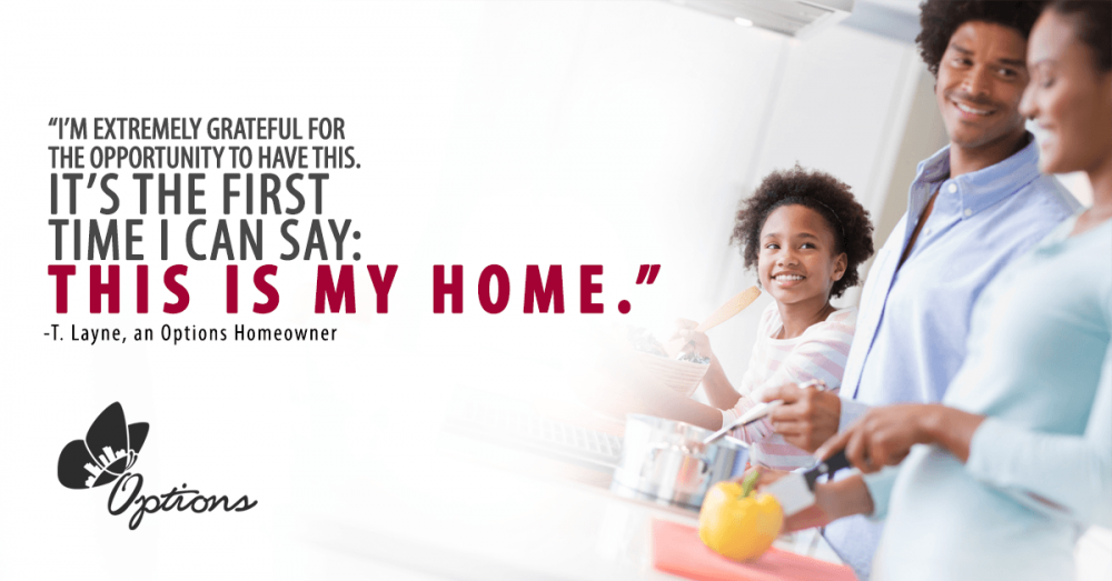
It is possible. What the target audience needed to hear was that the impossible dream of owning a new home was possible. That the power of owning a new home opened many new doors that many could only dream of. The one word that best describes how Options for Homes feels is “empowerment” or feeling “empowered.” It’s emotional and provides a solid foundation to transform the Options for Home brand into something they could become. Now all we had to do was execute it and give it an identity.
A logo is not a brand but it can help shape expectations
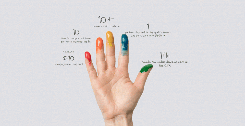
We ultimately decided to land on a visual solution that combined a nesting device within a strong symbol that evoked security. A large “O” that was formed by several multi-coloured crescent shapes was inserted into the Options name. Underneath the all caps name OPTIONS, was a simple reinforcement of what they do, FOR HOMES. The tagline was also very important. We knew it would be crucial to holding it all together – “It is possible.”
It was straight forward, strong and balanced, with a compassionate approach that provided a sense of security, honesty and empowerment. It sent all of the right signals.
![]()
A train of possibilities
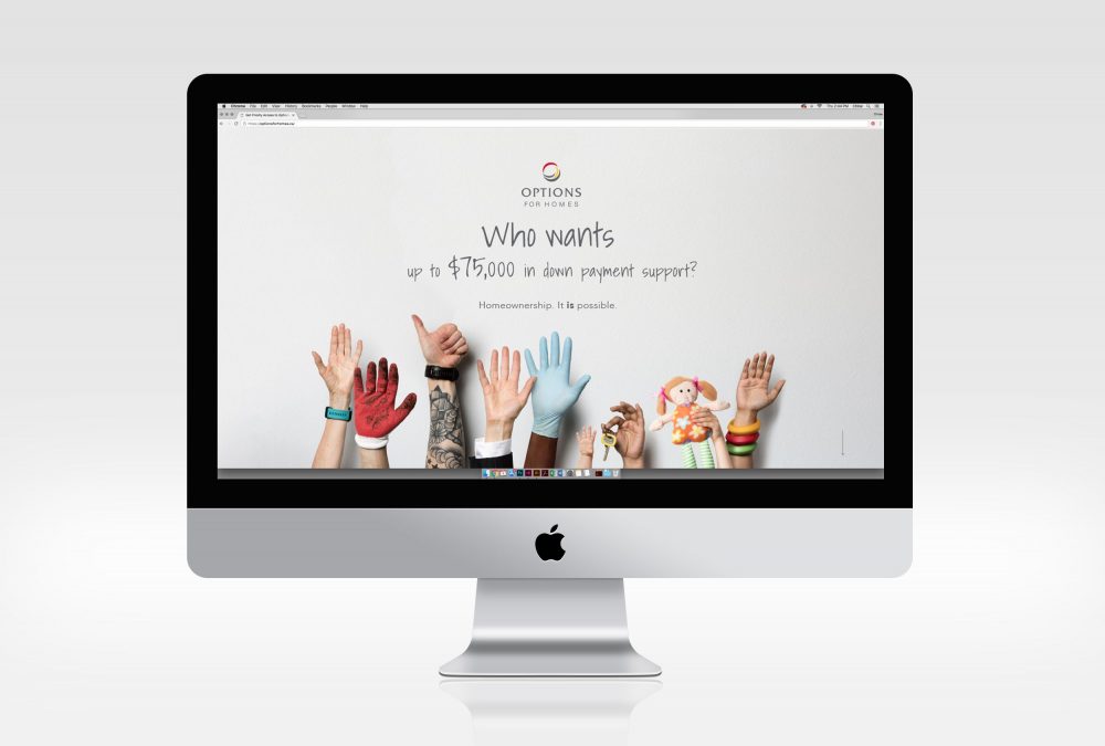
We love thinking outside the box. Our client had used transit advertising in the past and it was acknowledged that this medium targeted their audience well. Unfortunately, most of the feedback from the previous advertising was that it looked a bit generic, unbelievable and not competitive. Hangar 18 inherited a media buy that was already negotiated and we had to be very efficient in our thinking. The client was able to get enough media space on two single train cars to take up the entire train with interior transit cards. This is a lot of media to fill and we needed to come up with something that had a grassroots appeal and was empowering in the message.
The breakthrough came from thinking about ice cream
Our big breakthrough was to create a grassroots, modular marketing campaign that spoke to their audience directly and receives positive support with a show of hands held high in the air. The inspiration came directly from thinking about ice cream. When you ask “who wants ice cream?” to a crowd of hungry people, you wouldn’t be surprised to see a bunch of hands in the air and hear “I do, I do!” That’s the basic idea. We asked a provocative question and took photographs of a lot of different hands that represented the wide audience that makes up the demographic. At the Hangar 18 photoshoot, we used different types of hands from many types of industries, all held up high in agreement. Some questions were straightforward, while some were slightly amusing. All were compelling. We then strategically placed, “It is possible” and proudly displayed the new logo. The tone of voice suggested honesty and were straightforward in nature. The original photography allowed for multiple types of executions to be conceived and executed later in the campaign as well as for years to come. Our team thought of different seasons, different applications, all types of jobs and even chores around the house. We covered as many bases as we could to maximize flexibility and efficiency. We also shot a video at the same time for some social media possibilities. Options for Homes was very happy.
Who wants their grown kids out of the basement?
We love our client. They helped push us to the core thoughts of what their demographic needed to hear– like wanting their grown kids out of the basement, or wanting to paint the walls of a bedroom any colour they like. It was true to the newly developed brand personality and the sentiments drilled back to empowerment. The client contributed, writing some good headline starters and we replied with several of our own. Hangar 18 wrote dozens of headlines and expanded the idea to work for infographics and show unity and compassion. Some of the applications were intended to support imagery on the website, and even on the construction worksite and in the presentation centre. It was all encompassing.
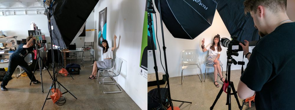
Shooting 23 adult hands, a photographer, two kids, a baby and a dog paw
Our team cast family members, employees, volunteers, pets, and even a few models. Our brilliant photographer, Martin Szabo who proudly wears a magnificent moustache, configured a system to shoot things efficiently and mathematically. The modular based campaign idea entailed shooting 900 separate images at different focal distances to the camera so we could later composite the single shots into much larger group scenarios if we so desired. We had tables and tables of props, accessories and wardrobe possibilities. In the two day shoot over the weekend, we planned to shoot enough material to cover an expansive wish list for the following two years. We even allowed time to shoot video and record wild sound for maximum editing flexibility for a series of grassroot videos for social media.
A new branded website that feels right
UX (User Experience) is so important and much of our time was spent finding the best way to get the new message across that felt professional, yet approachable. We borrowed imagery from the photoshoot and advertising campaign and edited the old website down to the most important and relevant materials possible. Hangar 18 then added a tone of voice that was friendly and engaging. Our designers created simple and original infographics and went back and forth with the client to streamline the web vision of empowerment. The result was consistent with the brand look and feel that we had set out to deliver. The client was delighted and the transformation was complete.
Who wants a grassroots video campaign in the mix?
Hangar 18 shared with Options for Homes that it is possible to shoot video at the same time as the photoshoot and it could be used for social media purposes and powerpoint presentations down the road if desired. Since Hangar 18 had all of the models, props, location and photographer available, we took it upon ourselves to shoot just a bit more that could be edited later for a very nominal cost.
We relied on the skill sets of the photographer, a director and part time editor and a composer. The composer and owner of a new sound house in town helped us with a simple and original demo track that the client fell in love with. Thank you Alex at Fresh Ears Audio for working with the H18 team on this project.
Hangar 18 Design loves to create engaging videos whenever possible. Often the client doesn’t even think about video until it becomes too late to create efficiencies. With a simple idea and a flexible schedule, you can do so much. Our video idea needed a very grassroot feel that further reinforced the empowerment brand platform. Who wants to see it?
Written by Dean Ponto, Partner and Co-Creative Director – Burnaby, BC